Client: New York Flyers
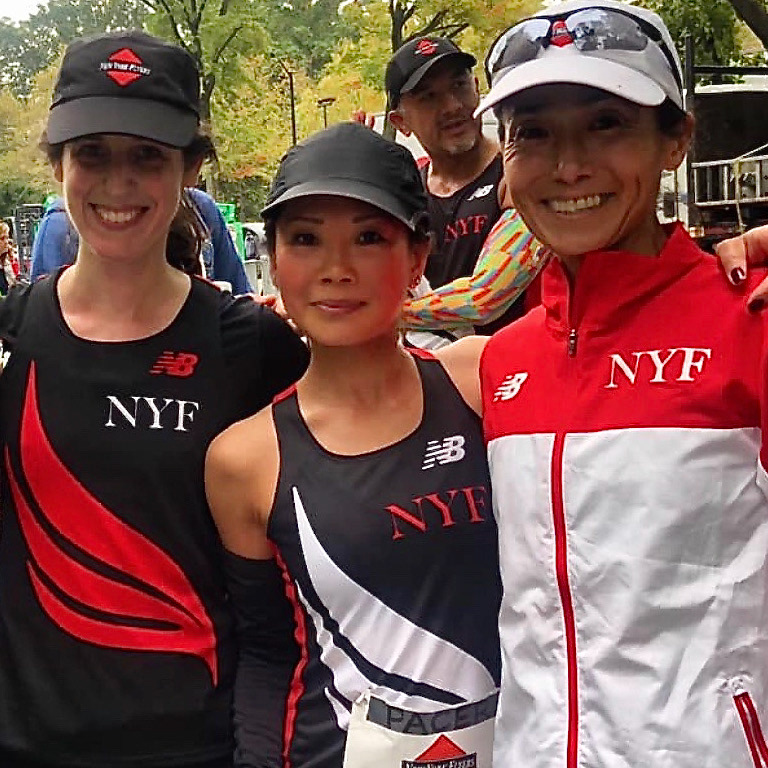
Mission: The NY Flyers was founded in 1989 and is one of the oldest and largest running clubs in New York City. Members train together, cheer for each other at races, and socialize.
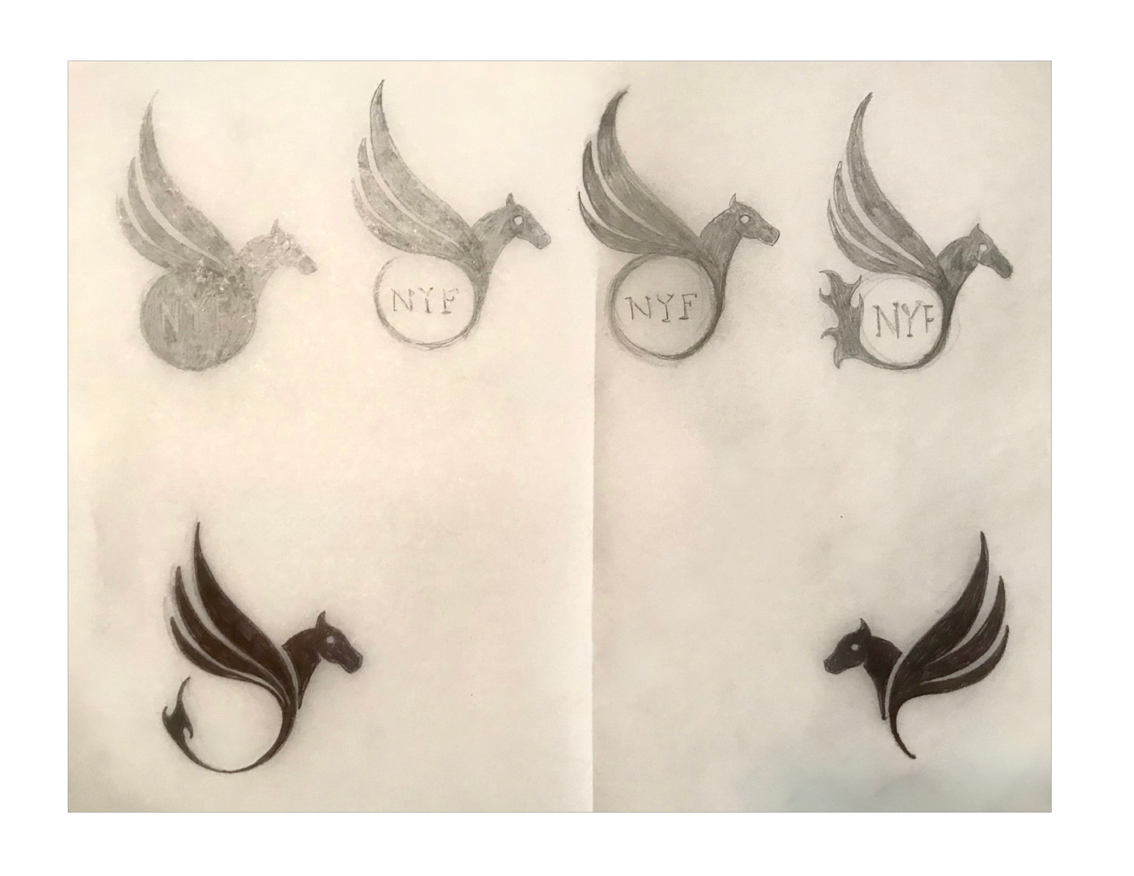
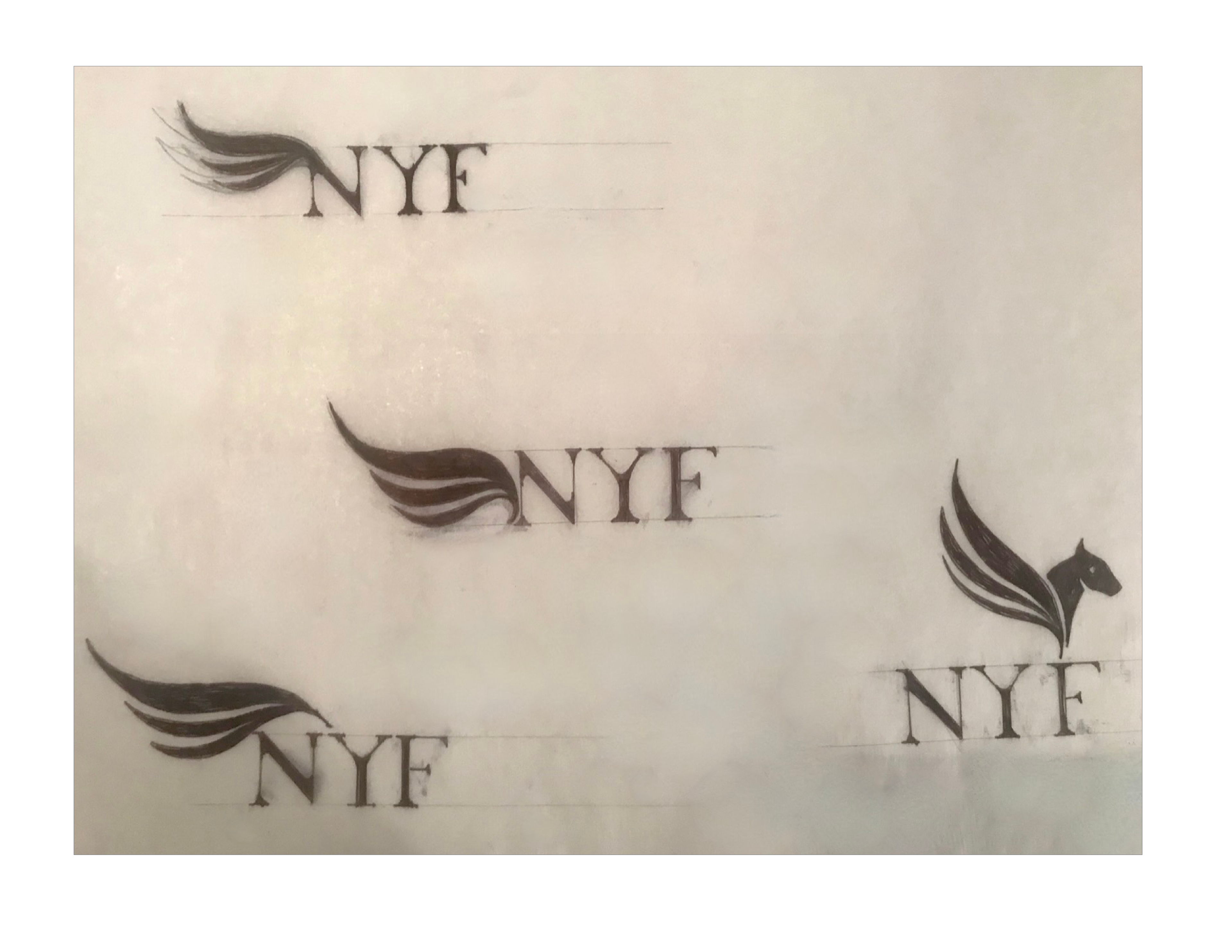
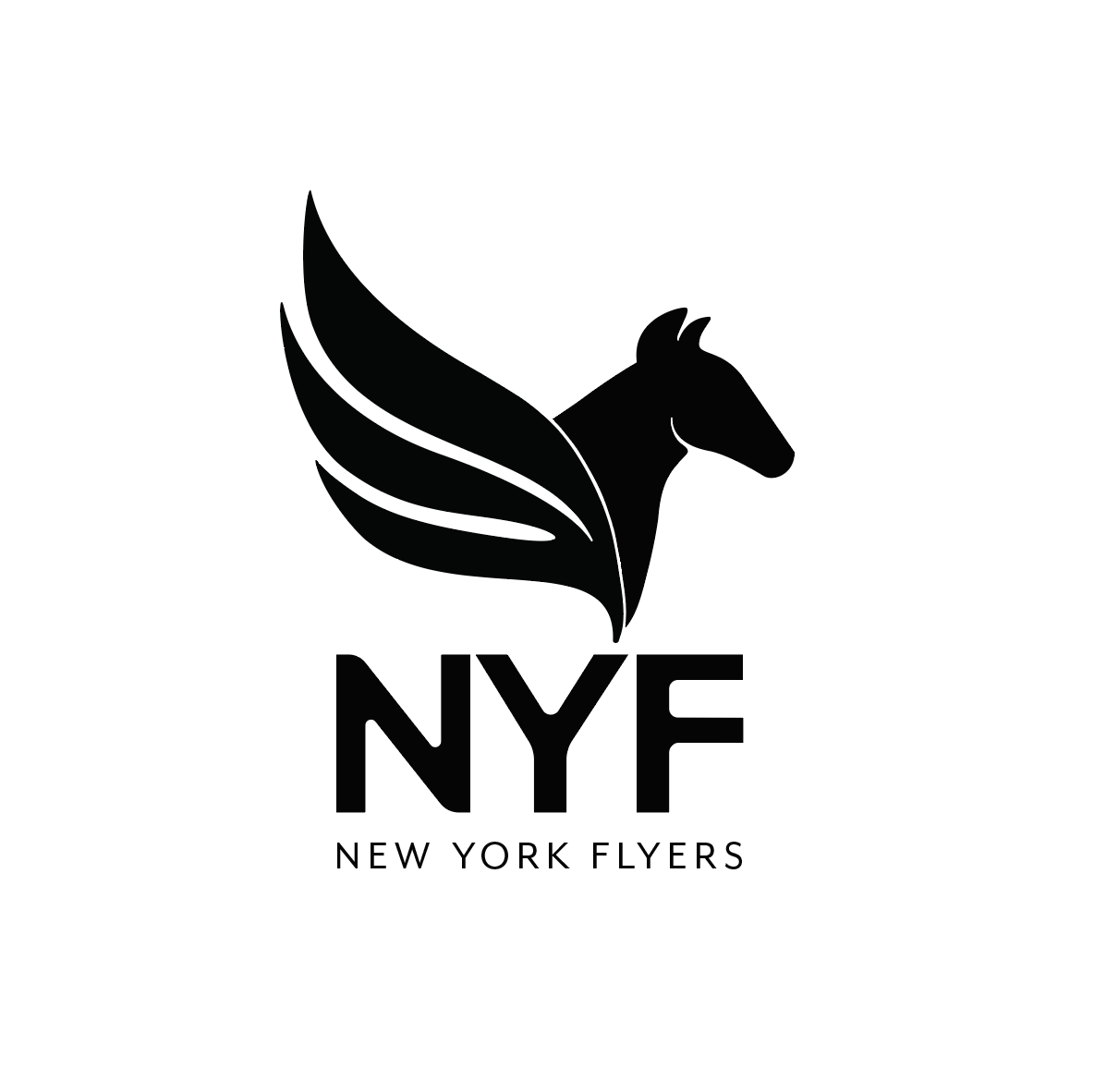
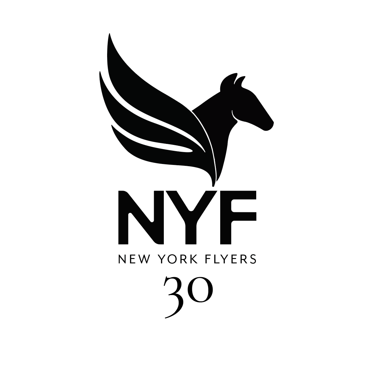
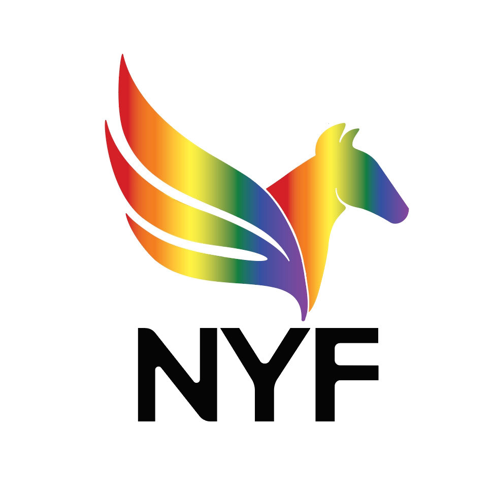
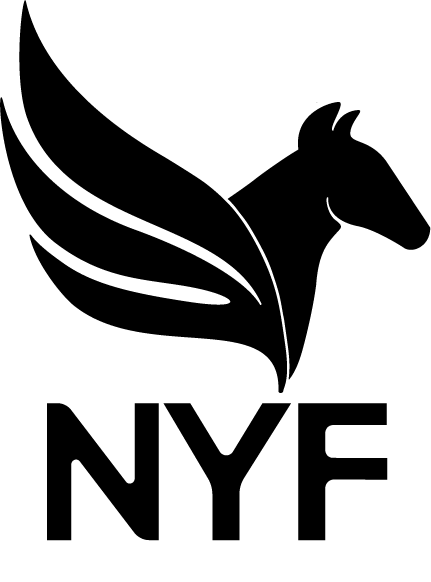
Meaning: The Pegasus is symbolic of speed, strength and freedom, soaring beyond the boundaries of the physical world where the spirit has no limits. The Pegasus and all elements of the mark serve as a rallying call to inspire all members to achieve their goals and move the club forward
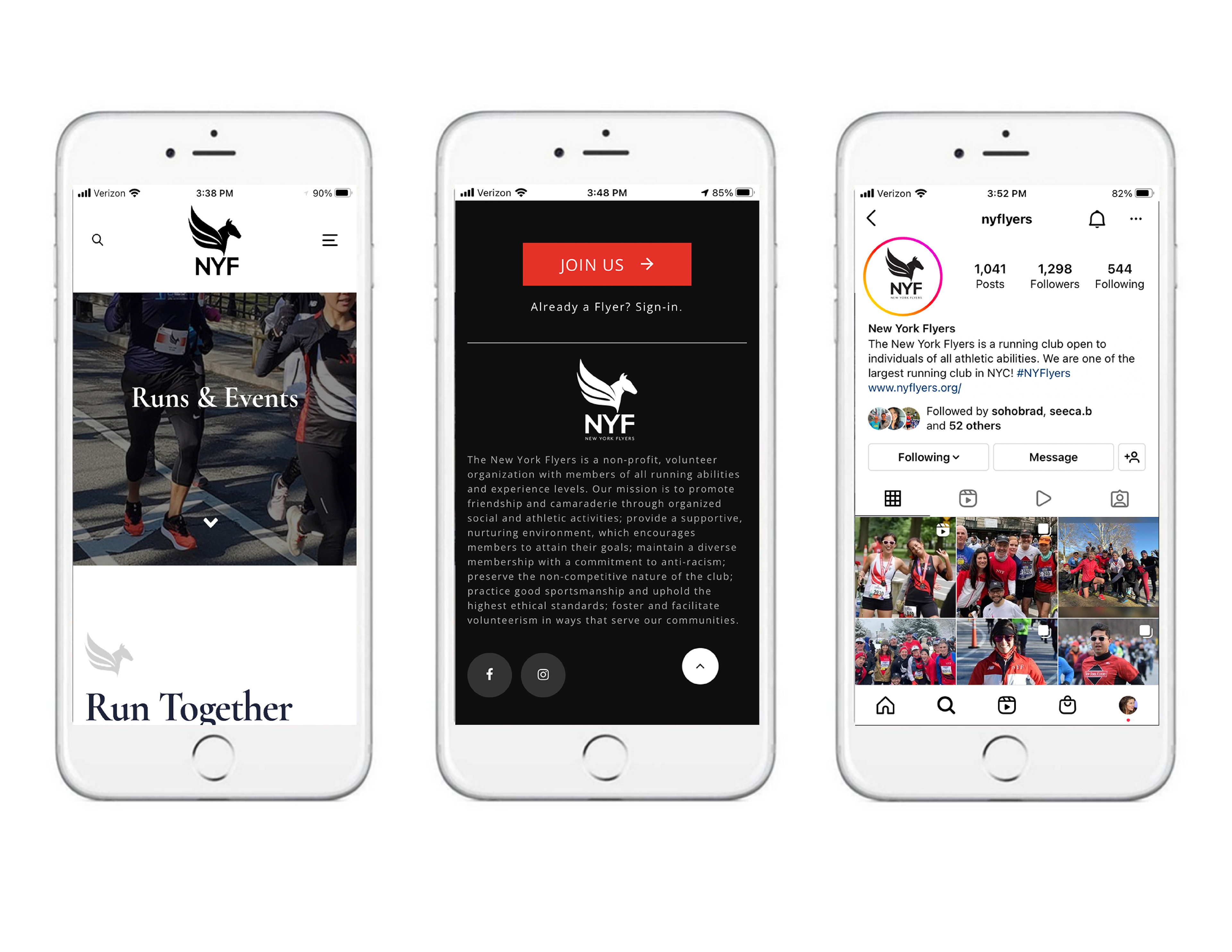
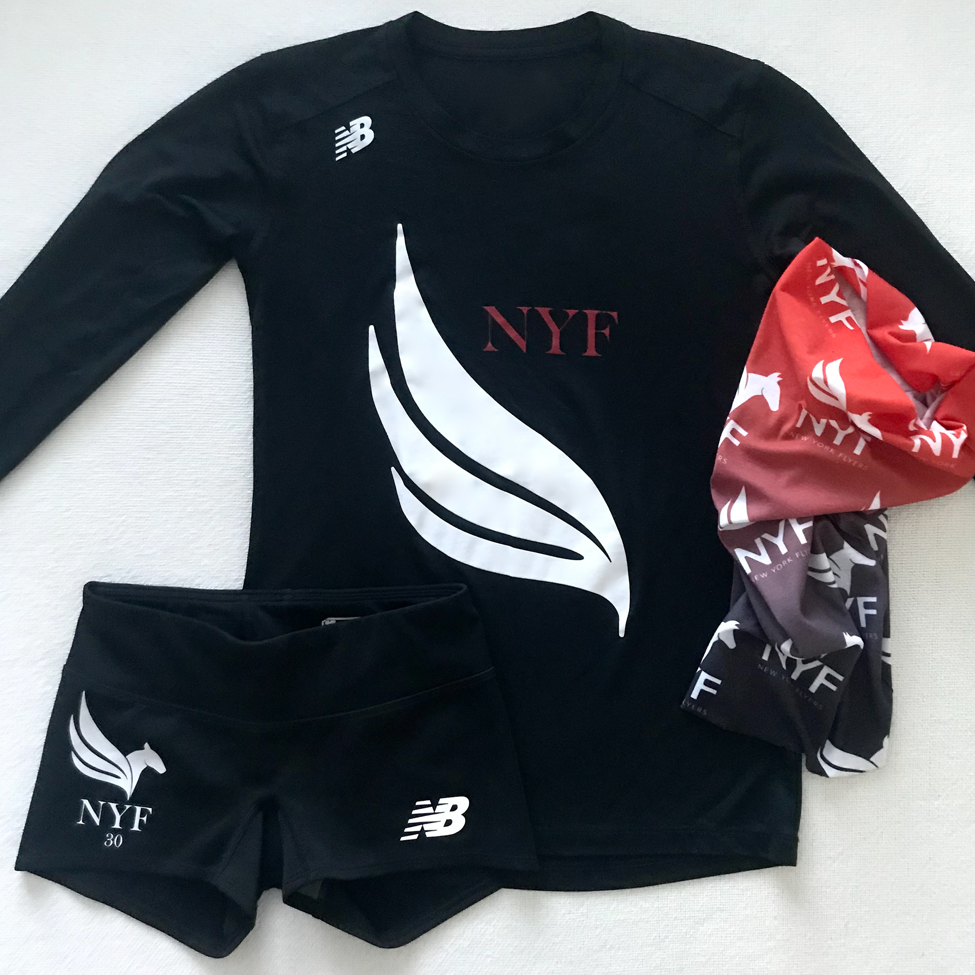
Project Scope: Logo Design & rebranding for 30th anniversary to represent the club’s ethos and revised mission across all touch points — website, social media, apparel & accessories, signage and collateral
Solution: Reinvision the visual representation of the club's values with a modular logo that remains striking and coherent across multiple platforms including digital, print and clothing. The rebranding serves to create a more relevant and striking visual representation of the club and broaden its demographic to attract a more diverse age group and guide the club into the next 30 years.